Tuesday, September 30, 2008

Get the Horns Ready... Man The Drumline....

Tah Tah Da Dah!!!
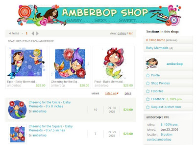
It's hot - It's cute - It's Sassy...Sexy...Sweet...

That's right lovelies! After years of buying handmade I decided it was time to jump on board and get my own shop. You can pick up my art and use it as it's intended.
Get it up on your walls!
Ok, run don't walk!

PS. In other exciting news: I had the best hair day of the year today :) I had three strangers ask me about it, one even asked where I "had it done."

Saturday, September 27, 2008

Why I'm feeling Icky...

Last night, while the nation was distracted by the bailout plan, the Senate passed the Orphan Works Bill. I've been working at opposing this bill for six months now. It is oh so obvious that congress is trying to slip it in under the radar. This act will affect all artists, writers, choreographers, photographers etc. it is important that we act now to stop it becoming law. Over 70 creators organizations are opposed to this bill and working hard to stop its passage.
Please write your congress rep by clicking below. You'll find a simple form letter that will seriously only take two minutes to complete.
Please help!
http://capwiz.com/illustratorspartnership/issues/alert/?alertid=11980321
xo,
Amber

If you'd like to read more about it:
For more info: http://ipaorphanworks.blogspot.com/

This is overview of how this bill will affect the art world: excerpts from:
http://capwiz.com/illustratorspartnership/issues/bills/?billid=11320236

**The Orphan Works Act defines an "orphan work" as any copyrighted
work whose author any infringer says he is unable to locate with what the infringer himself decides has been a "reasonably diligent search."In a radical departure from existing copyright law and business practice, the U.S. Copyright Office has proposed that Congress grant such infringers freedom to ignore the rights of the author and use thework for any purpose, including commercial usage. In the case of visual art, the word "author" means "artist."

** This proposal goes far beyond current concepts of fair use.
As acknowledged by the Register of Copyrights it is not designed to deal with the special situations of non profit museums, libraries and archives. It is written so broadly that it will expose new works to infringement, even where the author is alive, in business, and licensing the work.

** The bill would substantially limit the copyright holder's ability to recover financially or protect the work, even if the work was registered with the U.S. Copyright Office prior to infringement.

**The bill has a disproportionate impact on visual artists because it
is common for an artist's work to be published without credit lines or because credit lines can be removed by others for feckless or unscrupulous reasons. This is especially true of art published in the Internet Age.Coerced Registration

**The Orphan Works Act would force artists to risk their lives' work to subsidize the start-up ventures of private, profit making registries, using untested image recognition technology and untried business models. These models would inevitably favor the aggregation of images into corporate databases over the licensing of copyrights by the lone artists who create the art.

**The most common scenario of orphaning in visual art is the unmarked image. There is only one way to identify the artist belonging to an unmarked image. That would be to match the art against an image-recognition database where the art resides with intact authorship information.

**These databases would become one-stop shopping centers for infringers to search for royalty-free art. Any images not found in the registries could be considered orphans.

**There is no limit to the number of these registries nor the prices they would charge artists for the coerced registration of their work.

**The artist would bear the financial burden of paying for digitizing and depositing the digitized copy with the commercial registries.

**Almost all visual artists such as painters, illustrators and photographers are self employed. The number of works created by the average visual artist far exceeds the volume of the most prolific creators of literary, musical and cinematographic works. The cost and time-consumption to individual artists of registering tens of thousands of visual works, at even a low fee, would be prohibitive;therefore countless working artists would find countless existing works orphaned from the moment they create them.

**The Copyright Office has stated explicitly that failure of the artist to meet this nightmarish bureaucratic burden would result in his work automatically becoming an "orphan" and subject to legal infringement.

Sunday, September 14, 2008

Set Those Colors, Set Them Good....

Ok, so here's how it goes with me. I was raised with this idea that anything worth doing is worth doing right. This concept instilled by my parents kind of backfires in that I over analyze if what I'm doing is actually worth my time.... Here's something that's always worth the extra thought process: setting line focused color palettes!
Here's a look at the way I do it.

My Island Fever post and this little line drawing below are from a new line I'm developing, 'NoKaOi' There will be a sneak peek on my website before too long. NoKaOi is Hawaiian for "Is the best." It felt like the right name for this bright, high energy series.

I'm often asked how I stay out of trouble when it comes to the different 'looks' I create and multiple styles I use. For a long time I limited myself and only drew one way after hearing time and time again from different studio execs that my stuff was "Too all over the place," or "Not cohesive enough." I think that those sometimes career killing criticisms are typical for any young artist. Over the years I've come up with a few tricks. Now I hear "I love your diversity." "This style here is so exciting, but I love what you're doing on this other line too."

One of the tips I can offer up when you're getting "why are you so all over the place?" from the people sitting on the other side of the big fancy desk is to set separate definitive looks, not sloppy, not all over the place, COHESIVE. One of the quickest tickets to cohesion is setting a definitive color palette for your line. I know if I'm water coloring Baby Mermaids and I need a purple, exactly WHAT purple it's going to be. I make myself pick two or three shades of purple that I cannot live without especially for the baby mermaids. It's too subtle for the viewer to really pick up on. They won't know that I only use such and such pigment with such and such drawing. When they see those colors they subconsciously know that they go with 'Baby Mermaids' and they never think to ask why there isn't cohesion. They don't ask because it's not "all over the place". It's planned. Color isn't the easiest thing in the world for me. I love doing it, but I have to work hard at getting it right. Before I decide that something I'm developing is worthy of carrying its own line I do a hell of a lot of sketching. I see something start to grow and when I can tell it's going to be larger than life I jump on it. That's when I know it's time for some 'crayoning'.

I colored in the little wahini babe above a few different times. I liked this version the best. I played around with the Island Fever design until I felt it was just right. I colored in two other 'NoKaOi' designs and massaged them back and forth. When you're doing this take breaks! Get up and walk around. Print out a copy put it up on your wall, grab an apple and take a walk or read a book. When you come back into your studio, turn your back on your drawing, close your eyes then spin around and open them. What do you think? It's my Family Feud (gosh i hate that show so much) approach to art. Whatever that first thought on your mind is--go with it. If it's "Too red!" Or "Washed Out". Or "Too much contrast." Don't just stand there! Fix it!!

Once you're happy with a majority of your color with a few of your line's drawings and the colors 'feel right' you're ready to set a color palette. As you all know, I hate limiting my creative process. Sure, setting a color palette before you start coloring is a LOT easier, but will it get you the results you want? Maybe, but probably only if you're friggin' Leonardo Divinci.

My process is different depending on the medium. "NoKaOi" is all digital, baby. So here's how I roll. I pull everything I've colored into Photoshop. I start by pulling up a blank 8x11" page at 72dpi that I lay beside the first illustration I'm sampling. One at a time and starting at the tippy top of the page I eye drop every color I've used to pull each illustration together. I make a little square box on a separate layer with the rectangular marquee tool (m). I'm a hot key fiend, I suggest you become one too. I start by filling in that one square with a color I've sampled. Then I duplicate it and drag it over and color that new square in with the next color, so on and so on until I've created a line. Then I duplicate that line and take down the saturation until it's all greyed out and start laying those grey bars down until I have a perfect grid. I know that anywhere a grey box is that's where color isn't. I use each illustration I've already colored and sample every color I've used. If I'm running out of room I just select my grid layer and transform it (t) making it smaller and then duplicating it, desaturating it, all the while coloring in the boxes with my colors as I go.

So after I'd sampled all four illustrations this is what I came up with: It's a mess, yes I know, but have faith. It's going to get better and then it's going to make me a lot of money.

I then duplicate that grid in the Photoshop document and call it a color's name. I'll show you with "yellow." I turn off the master grid, and then I go to work on our new 'mad about saffron' layer. I use the rectangle marquee tool and I select large groups, everything that's not yellow, and I delete it until all that's left is every yellow that's been used on my four illustration. Here's what I ended up with:

I then go nuts with my marquee tool, rearranging the little squares so that they overlap one another and so that I can see what's really going on. I sometimes hide (cntl h) the marquee lines as I sidle up shades next to one another, always trying to get like closely next to like. I make weird free form shapes as I do this. Since this line I'm developing is so tropical, read: sandy, I ended up with a plethora of yellow shades. Here's that odd free form I made:

Now I start over on this yellow layer, making my little empty marquee boxes I fill them in with eye dropped color from this weird skeleton key of yellow. I try to get shades that are diverse and I start to edit out shades that are repeated or just too close to their neighbors to really be important. Here's what that looks like when I'm finished:

At this point I delete my weird shape and save having gotten the just out of that particular color collage. I'm left with a clean line of color.

I go through and make a color layer for every set in the grid. Below you're looking at the middle of my "pinks" sorting process. I'm layering them up in the far right - middle of the page. When I'm not sure if I've already picked up a color there are some on this sheet that look like they might have been picked up on the 'orange' pass, but maybe they weren't and if I'm in doubt I pick them up anyway, it all comes clean in the end.

When I'm all done sorting I make a hierarchy of color lines. Here you'll see every color I saw worth saving: Hopefully you're well aware that this many colors will in no way distinguish a line. It's editing time, kiddos.

I check colors next to each other. I see what dark green I'm going to keep. Those three next to the darkest green look too close to the same color to keep. I settle on the one that I think is the best and I keep going. I'm using my editor eye. If it can go I cut it. I'm trying to get rid of stuff. Imagine your little color boat sinking.... You can only save the colors that stay in the boat but you're just too heavy and sinking fast. You need to throw out the ones that are superfluous.

If you have three dark 'Dr.Browns' and one of them is a gynaecologist, the other's a general practitioner and you've got a podiatrist keeping them company which two you going to get rid of? Be that cold and get chucking. Keep your work horses. If you have a dark brown that could be waihini hair but is also the color of coconuts, shaggy dogs and can lend a hand with the jungle trees, keep it. If you have a hot pink that is only the color of crazy bikinis, but you LOVE those crazy bikinis keep that too, but use discretion
.

I put everything into my last and easiest to read grid, save it as "NoKaOi Master Color" and call it a day. You should too, it's getting late. Hope this helps. Remember the secret to real success is to keep on trying, try smarter, you don't always need to try harder. Oh and don't forget to sub out colors on those first "test" illos. Remember, cohesion is king :)

Saturday, September 13, 2008

Island Fever


Thursday, September 11, 2008

"Working"

If a Cluttered Desk is a Sign of a Cluttered Mind, What's an Empty Desk a Sign Of?"
-Albert Einstein

Wednesday, September 03, 2008

Pammy Kay and Fire Island

Oh how do I love camping? Let me count the ways...

I trust that all you lovely blog stalkers had perfect long weekends. To celebrate labor I took off with a few friends and made a pilgrimage to an island of fire, specifically, Fire Island.
I was hoping to get more sketching done. Unfortunately I did not. I was too busy fighting off bugs and small children. Despite the aforementioned little issues, I had a great time. I read my book and lazed the day away, I played in the water and slept on the sand and I did a LOT of laughing. Everything about Fire Island took my breath away. I cannot believe how close it is and yet how far away it seems. Growing up in Hawaii has a lot of advantages but one of the disadvantages is that whenever I'm away from a large body of water for too very long I start to freak the hell out. Let's just say I needed to get away a bit.

I think I may need to find new friends by this time year.... I'm pretty sure Shilo and Sara "aren't never going to sleep on no @#!$% ground on no @#$!!(#**! island again." Poor dears didn't stand a chance. There's one time a year where I'm happy that my blood is so nutrition deficient and that's bug season at camp :)
The terrain was inspiring, the whole island has a boardwalk that stretches across it in a nice ambling sort of way. The sky seemed so big and the stars made the whole trip worth it just by themselves.
August 18th was my NY anniversary. It's been eight years since I trudged three thousand miles to start school at Pratt with nothing but a large duffel bag and a wild set of bangs. I never thought I'd fall so in love with the Atlantic, but have to say that I truly feel at home on its shore. I feel so lucky to be living this beautiful life surrounded by people I love while I nurse a thriving career in a city that still thrills me. It's enough to make a girl blush.

LinkWithin

Related Posts with Thumbnails