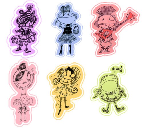
Here's a look at the way I do it.
My Island Fever post and this little line drawing below are from a new line I'm developing, 'NoKaOi' There will be a sneak peek on my website before too long. NoKaOi is Hawaiian for "Is the best." It felt like the right name for this bright, high energy series.
 I'm often asked how I stay out of trouble when it comes to the different 'looks' I create and multiple styles I use. For a long time I limited myself and only drew one way after hearing time and time again from different studio execs that my stuff was "Too all over the place," or "Not cohesive enough." I think that those sometimes career killing criticisms are typical for any young artist. Over the years I've come up with a few tricks. Now I hear "I love your diversity." "This style here is so exciting, but I love what you're doing on this other line too."
One of the tips I can offer up when you're getting "why are you so all over the place?" from the people sitting on the other side of the big fancy desk is to set separate definitive looks, not sloppy, not all over the place, COHESIVE. One of the quickest tickets to cohesion is setting a definitive color palette for your line. I know if I'm water coloring Baby Mermaids and I need a purple, exactly WHAT purple it's going to be. I make myself pick two or three shades of purple that I cannot live without especially for the baby mermaids. It's too subtle for the viewer to really pick up on. They won't know that I only use such and such pigment with such and such drawing. When they see those colors they subconsciously know that they go with 'Baby Mermaids' and they never think to ask why there isn't cohesion. They don't ask because it's not "all over the place". It's planned. Color isn't the easiest thing in the world for me. I love doing it, but I have to work hard at getting it right. Before I decide that something I'm developing is worthy of carrying its own line I do a hell of a lot of sketching. I see something start to grow and when I can tell it's going to be larger than life I jump on it. That's when I know it's time for some 'crayoning'.
I colored in the little wahini babe above a few different times. I liked this version the best. I played around with the Island Fever design until I felt it was just right. I colored in two other 'NoKaOi' designs and massaged them back and forth. When you're doing this take breaks! Get up and walk around. Print out a copy put it up on your wall, grab an apple and take a walk or read a book. When you come back into your studio, turn your back on your drawing, close your eyes then spin around and open them. What do you think? It's my Family Feud (gosh i hate that show so much) approach to art. Whatever that first thought on your mind is--go with it. If it's "Too red!" Or "Washed Out". Or "Too much contrast." Don't just stand there! Fix it!!
Once you're happy with a majority of your color with a few of your line's drawings and the colors 'feel right' you're ready to set a color palette. As you all know, I hate limiting my creative process. Sure, setting a color palette before you start coloring is a LOT easier, but will it get you the results you want? Maybe, but probably only if you're friggin' Leonardo Divinci.
My process is different depending on the medium. "NoKaOi" is all digital, baby. So here's how I roll. I pull everything I've colored into Photoshop. I start by pulling up a blank 8x11" page at 72dpi that I lay beside the first illustration I'm sampling. One at a time and starting at the tippy top of the page I eye drop every color I've used to pull each illustration together. I make a little square box on a separate layer with the rectangular marquee tool (m). I'm a hot key fiend, I suggest you become one too. I start by filling in that one square with a color I've sampled. Then I duplicate it and drag it over and color that new square in with the next color, so on and so on until I've created a line. Then I duplicate that line and take down the saturation until it's all greyed out and start laying those grey bars down until I have a perfect grid. I know that anywhere a grey box is that's where color isn't. I use each illustration I've already colored and sample every color I've used. If I'm running out of room I just select my grid layer and transform it (t) making it smaller and then duplicating it, desaturating it, all the while coloring in the boxes with my colors as I go.
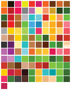
So after I'd sampled all four illustrations this is what I came up with: It's a mess, yes I know, but have faith. It's going to get better and then it's going to make me a lot of money.
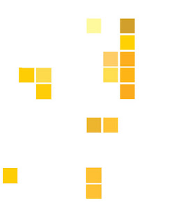
I then duplicate that grid in the Photoshop document and call it a color's name. I'll show you with "yellow." I turn off the master grid, and then I go to work on our new 'mad about saffron' layer. I use the rectangle marquee tool and I select large groups, everything that's not yellow, and I delete it until all that's left is every yellow that's been used on my four illustration. Here's what I ended up with:
 I then go nuts with my marquee tool, rearranging the little squares so that they overlap one another and so that I can see what's really going on. I sometimes hide (cntl h) the marquee lines as I sidle up shades next to one another, always trying to get like closely next to like. I make weird free form shapes as I do this. Since this line I'm developing is so tropical, read: sandy, I ended up with a plethora of yellow shades. Here's that odd free form I made:
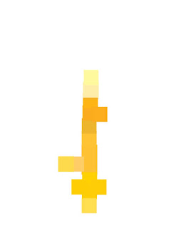
Now I start over on this yellow layer, making my little empty marquee boxes I fill them in with eye dropped color from this weird skeleton key of yellow. I try to get shades that are diverse and I start to edit out shades that are repeated or just too close to their neighbors to really be important. Here's what that looks like when I'm finished:

At this point I delete my weird shape and save having gotten the just out of that particular color collage. I'm left with a clean line of color.
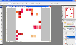
I go through and make a color layer for every set in the grid. Below you're looking at the middle of my "pinks" sorting process. I'm layering them up in the far right - middle of the page. When I'm not sure if I've already picked up a color there are some on this sheet that look like they might have been picked up on the 'orange' pass, but maybe they weren't and if I'm in doubt I pick them up anyway, it all comes clean in the end.
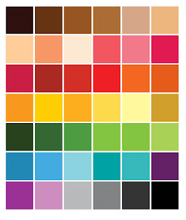
When I'm all done sorting I make a hierarchy of color lines. Here you'll see every color I saw worth saving: Hopefully you're well aware that this many colors will in no way distinguish a line. It's editing time, kiddos.
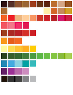
I check colors next to each other. I see what dark green I'm going to keep. Those three next to the darkest green look too close to the same color to keep. I settle on the one that I think is the best and I keep going. I'm using my editor eye. If it can go I cut it. I'm trying to get rid of stuff. Imagine your little color boat sinking.... You can only save the colors that stay in the boat but you're just too heavy and sinking fast. You need to throw out the ones that are superfluous.
If you have three dark 'Dr.Browns' and one of them is a gynaecologist, the other's a general practitioner and you've got a podiatrist keeping them company which two you going to get rid of? Be that cold and get chucking. Keep your work horses. If you have a dark brown that could be waihini hair but is also the color of coconuts, shaggy dogs and can lend a hand with the jungle trees, keep it. If you have a hot pink that is only the color of crazy bikinis, but you LOVE those crazy bikinis keep that too, but use discretion.

I put everything into my last and easiest to read grid, save it as "NoKaOi Master Color" and call it a day. You should too, it's getting late. Hope this helps. Remember the secret to real success is to keep on trying, try smarter, you don't always need to try harder. Oh and don't forget to sub out colors on those first "test" illos. Remember, cohesion is king :)